思法自然 與空間和平共處
此靈感取樣自馬雅文化石牆,透過鑿線堆疊,建構空間的層次和趣味,並盡可能地引進日光,留存質材紋脈,讓小單元劃分的場域性質,有條不紊各得其所。
Emulating the natural criterion.Peacefully coexist with the primitive feature of the space.
The inspiration is sampled from stonewall of Mayan culture.Through chiseling and stacking, construct the layering and intriguing of space.And as much as possible to introduce the sunlight; meantime retain the material original texture, so as each small section achieved the spatial property orderly and properly.
沿著巷弄探身走進陳舊華廈內,20坪的舊屋洗去塵染,蛻身成為寧靜隱斂的辦公場域。以「回歸原初本質」為筆墨,泥作板材為紙張,光影彩度為句讀,大筆揮毫出剛柔並濟的空間章幅。在遵循「形隨機能」的自然法則下,我們保留建物原有的輪廓和肌理,僅透過軸線轉折呈顯有機型態,於深淺對比的質材交扣間,演繹空間獨有的層次律動,逕自流淌一絲洗鍊氣韻。
Design PropositionWalking along the bystreet into an aged building. The old house of 66 square meters transformed into as well as a rustic and sedate office. Take the advantage of the original structure, natural wood and bright hue to re-establish the solidity yet geniality space. Following the natural precedent of "functional configuration", preserve the original building mass and texture to present vivid patterns merely through the twist and turn of the main axis. With deep and shallow tinge contrasting materials, bring about innovative ambience and a distinct layered configuration of the space.
風格情境「空間」和「人」的內在結構,在本質上是相同的,打動人心的從來不是亮麗鮮明的外衣,而是由內而外兀自流露的淳厚底蘊及溫柔堅定的靈魂。作為辦公場所,「舒適度」是為最大考量,不論是對內部職員或外部賓客,貼近人心的感受才是我們最希望被接收到的。因此,將整體彩度降低,諧以灰階對比穿梭材質間的對話,形塑空間意趣,讓一切回歸本然,在需要大量思考和不受限制的產業性質下,創造一處純粹、無界的工作寓所。
Creativity & AestheticsAs people knows, glossy and glamour appearance would never makes people deeply touched, but the pure and firm soul that manifests from the inside out. And the inner quality of "space" and "human" is essentially identical. As an office interspace, "cozy" is the primary consideration, whether for staff or guests, hold high regard to their heart is what we most want them to perceive. Therefore, simplified the setting tinge, shaping spatial charm merely with gray-scale contrast hue materials, demonstrate the original profound feature, thus create homespun and unbounded working area.
空間配置近20坪的水泥方盒裡,經過反覆推敲、琢磨,重新定向空間節點和光源路徑,以減法建構空間,以加法鋪陳細節,並盡可能地引進日光,留存質材紋脈,讓小單元劃分的場域性質,有條不紊各得其所。施工初期,原想拆除量體所有隔間,以達到最大限度的通透寬敞,然而卻桎梏於原有的樑柱結構,遂而順勢與之和平共處,轉化為中島會議桌,不僅將缺陷轉為特點,更讓整體空間更添旨趣。
Space planningAccording to the space around 66 square meters, reoriented the spatial nodes and illumination routes after repeated deliberation. Construct the space by subtraction, and layout the details by addition, so as to well organized each small section. In the early stage of construction, in order to achieve the maximum transparency and spaciousness, attempt to dismantle the compartments, but they were restricted by the original beam-column structure, thereupon set up an island, which not only turned the defect into the highlight, but also made the whole space more amusing.
選材效用在空間的臉譜上,如何呈現鮮明輪廓,材質的妝點成了至要元素。不需濃妝豔抹、不需矯揉造作,暖一分則過於飽滿,冷一分則缺少溫度,我們只需忠實地呈現場域原有的質韻,讓歷經歲月沈澱後的面貌,予人以內心的渲染。水泥鋼構的粗獷紋理,貼陳實木皮板的質潤溫煦,透過鏡面投射與光影變化,量體交錯和線面之間,相得益彰。
Materials & Cost EffectivenessHow to present the distinct outline of the space, material selection has become the most important issue. There is no need for excessive decoration or disguise, just frankly states the primitive feature of the space. Make use of cement and steel structure of coarse texture and fine and glossy solid wood veneer, by way of the mirror staggered projection, lead to varied changes of light and shadow, accordingly introduce a timeless phenomenon.
1. 玄 關 / Entrance
2. 衛 浴 / Bathroom
3. 會議室 / Meeting Room
4. 茶水間 / Tea Room
5. 工作區 / Working Space
6. 辦公區 / Office
7. 事務區 / Business Area
村上春樹曾說過:「儀式是一件很重要的事。」
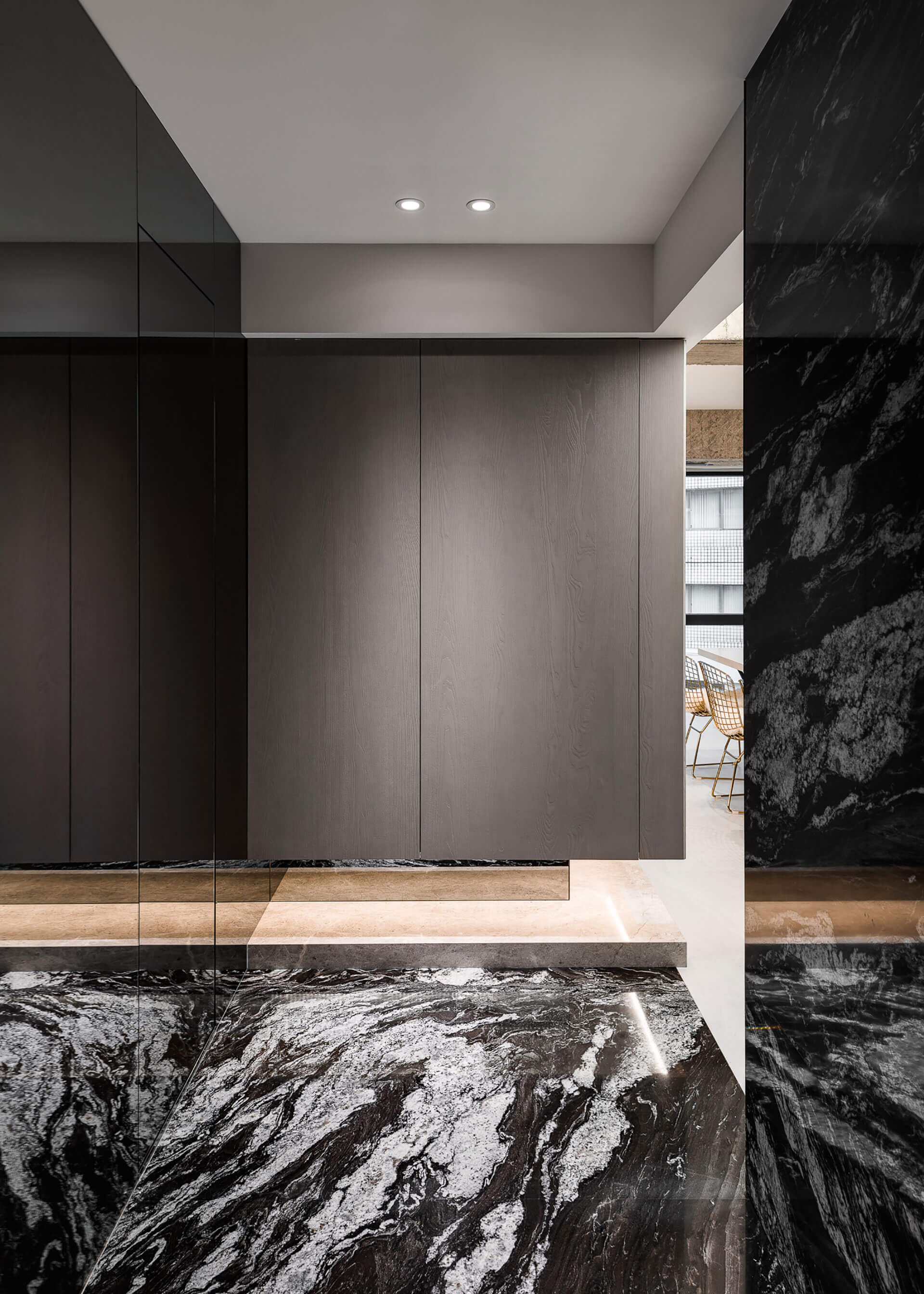
作為辦公空間的名片,玄關是予人第一印象的場域,因此我們特別選以雕刻黑的花崗大理石鋪墊入門氛圍,除增添推門入室後的儀式感,更為接下來的步伐遞增期待。而設計手法上,則採「先壓迫、後放大」的換位心理,視域由低調奢華轉為質樸原粹,方寸之間轉瞬的反差感,令人意猶未盡。臨側的衛浴空間,同樣延續此低奢光氛,僅僅是空間的一隅,卻滿是細節的鋪陳,大理石紋壁磚的柔和質調,在鏡面光源透射下,讓空間向度獲得延展。
Haruki Murakami once said, "Ritual is essential of living. "The entrance foyer plays a role as the office business card at the first impression, therefore, especially chosen black granite to initiate the introductory atmosphere.In addition to add a sense of ritual while entering the room, moreover to rise up the expectation to the space.In terms of the design techniques, adopted the transposition psychology of "first constrict, then zoom in". From low profile yet sumptuous to pristine and simplicity, the instantaneous contrast is stunning. The adjacent bathroom remained the low tone yet extravagant ambience, though just a corner of the space, but with abundant details.The gentle marble wall via the light transmitting of the mirror expanded the space.
是否曾想像過在辦公場所擁有像家宅一般的自適感受?進門後首先映入眼簾的,是如中島一般的大長桌,搭襯收束進牆面的開放茶水間,宛如家中的餐廚區域,自在而放鬆;即便是首次來訪的賓客,也能因此卸下心防,而平時需要獨立工作的職員,同樣能移轉至此,緩解思緒、恣意暢想,在工作時分調劑身心、感受生活。又考量原先的量體限制,我們在廊道過渡區上方,以軟膜天花板吊頂,其兼具防火防水及環保節能效用,更讓場域明度提亮,挹注一股別於原始況味的現代氛圍。
The pantry and the conference table——the imitated home bar and islandHave you ever imagined working in a comfy office just like being at home?While entering the space, the first thing that caught sight is a long table as like an island.The open pantry feels like being in the dining area at home that full of unstrained ambience.Even the first time visiting guests can enjoy themselves.The staff that wants to take break for a while or wish to ponder without disturbed commonly stays here for physical and mental relaxation.Considering the original building mass limitation, above the corridor transition zone, exploit the laminated glass sprung roof, which has the functions of fireproof, waterproof, environmental protection and energy saving. Further to brighten up the space and outline the modern implication that different from the original circumstance.
原先欲將公領域劃設為全開放式場域,卻因中間樑柱無法拆除,而形成一處畸零,我們索性將缺陷轉化為亮點,與之結合桌面,以中島概念發展出「家」的情境;使原本稍有距離感和帶有正式氛圍的會議桌間,頓時軟化了許多,亦形成和實牆作用相同的隔間,切割空間中的象限維度。而在縝密的計算過後,我們也發現,將天花板刻意壓低嵌以照明,能夠使粗大的樑柱,視覺上縮小,減低壓迫感,蛻皮後的RC鋼構,銜接輕盈量體,整體視域達至半通透的微光透亮。
The combination of beam-column and table-——transformed the spatial remnantAt the outset intended to set up an entirely coherent public area, however the central beam column is incapable to dismantled, thence leave a spatial remnant.Consequently turn the defect into a bright spot, combine the beam column with desktop, and established the circumstance with the concept of "home island", which instantly soften the conference table of the sense of formal, meanwhile formed a partition as like the solid wall.After thorough calculation, the designer figures out that lowering the ceiling and with embedding illumination can make the bulky beam column visually minify and reduces the pressuresensation. After modification, the reinforced concrete steel structure connect the lightweight massing, bring about a visual sense of semi-translucent for the whole space.
位處邊間的寓所,受限於開窗面積,光線無法通透入裡,因此,為消弭空間中的狹仄感,我們運用鏡體貼陳牆面,於有形中挹注無形,於有限中創造無界;輔以戶外日光和室內燈源的折射照明下,使光影穿梭其中,形構場域間的流動,讓視線所及皆能獲得延展,創造明亮淨朗的空間框景。
Wall-mounted mirror - extend vision and introduce sunlight into roomRegard to the sunlight is incapable shines into the end unit due to the limited area of the open window; therefore, wall mounted mirrors to eliminate the sense of narrowness of the space. Along with outdoor sunlight and indoor illumination, shaped the mobility of light and shadow of the space, as well as extending the vision to create a bright and lucid scene of the space.
以深淺木質作為空間的暗語,界定獨立的主管辦公室及開放的職員工作區,同樣為極需專注的場域,我們採用系統板材收納線路雜物,讓整體視野收束齊整、心無旁騖不受干擾。而為呼應空間的原始基底,特別綴以一抹綠意,由植栽延續至布幔,淡雅的自然質蘊流瀉而出。
Office zone - well-ordered circuits and sundriesBy way of utilize the deep and shallow timber to set out the executive office and the open staff work zone.Since of both areas extremely need focusing, therefore exploit system MDF to lay out the circuits and sundries orderly, bring out an overall neat and tidy vision without being distracted.In order to echo the primitive feature of the space, especially embellished with a touch of green, from plants to drapery, diffuse the natural stylish temperament.